Valsangiacomo Vini
Content Creation
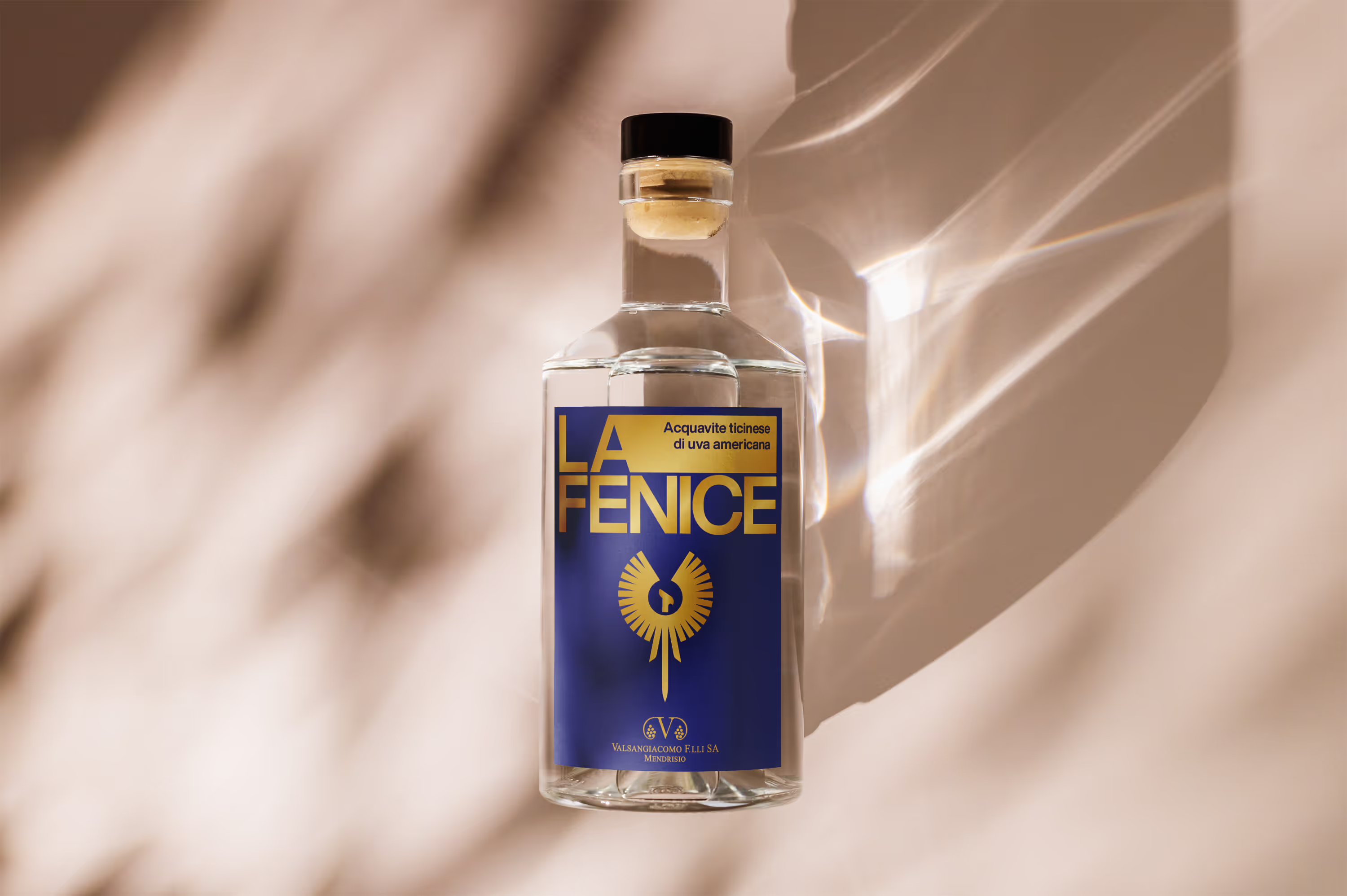
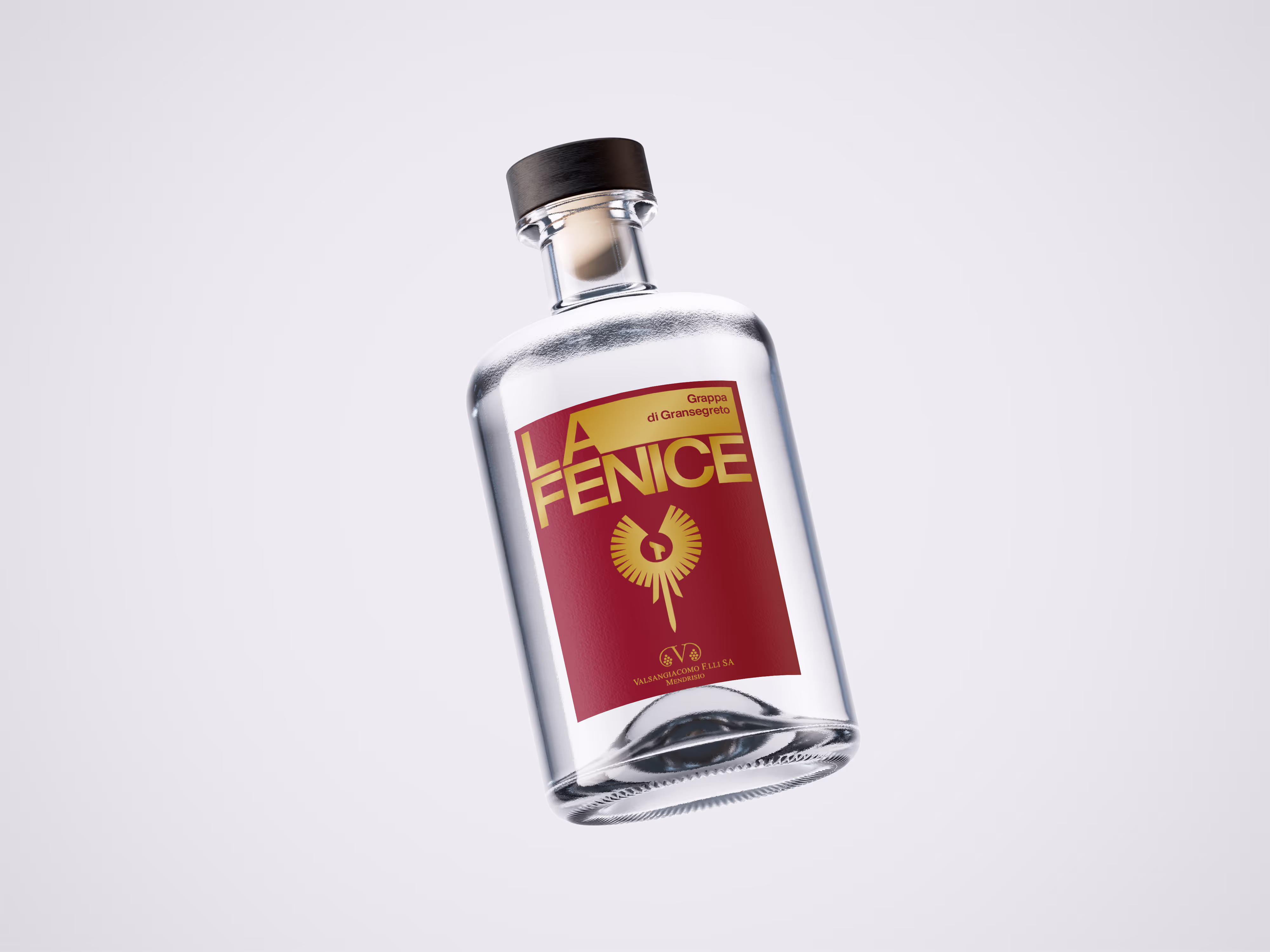
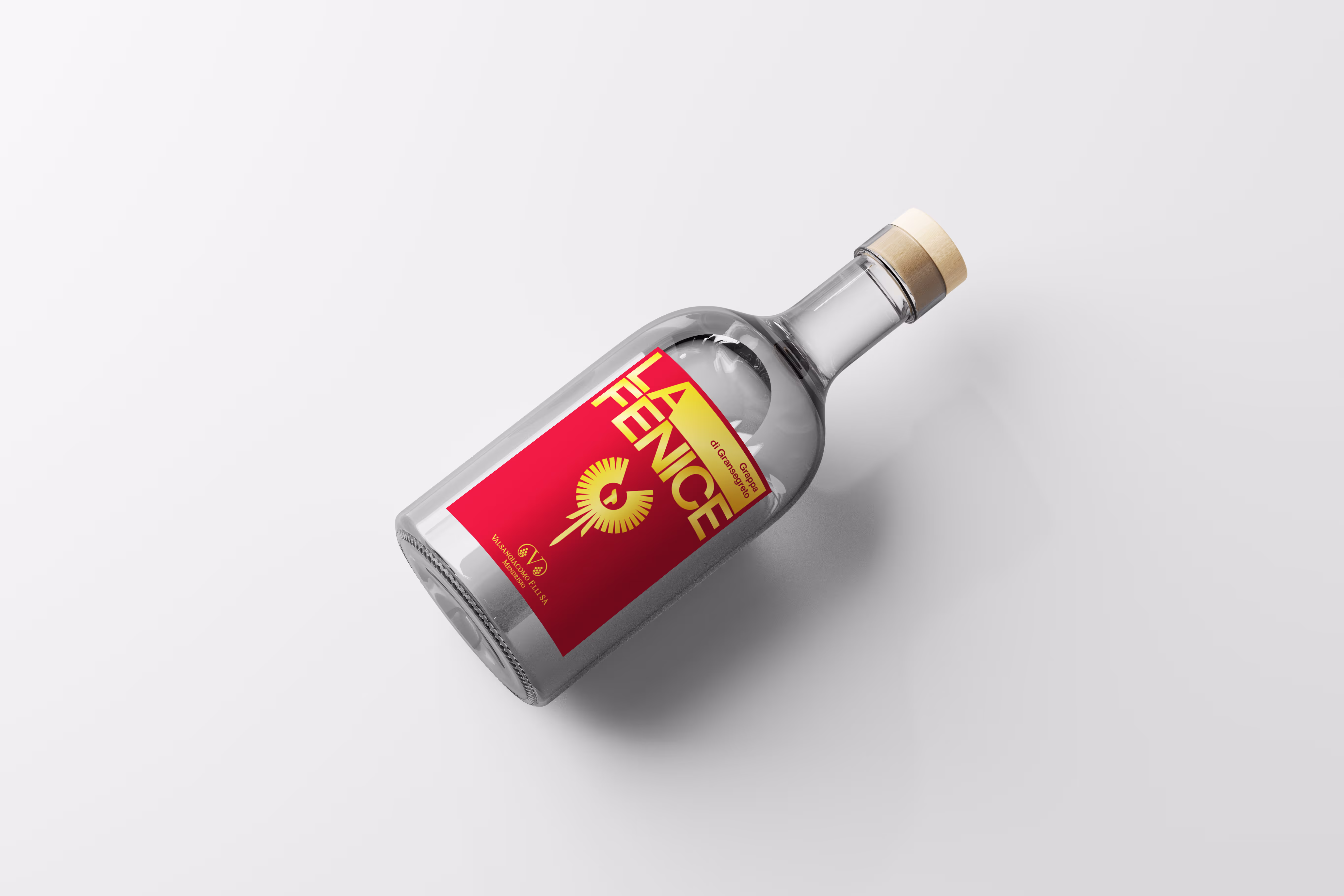
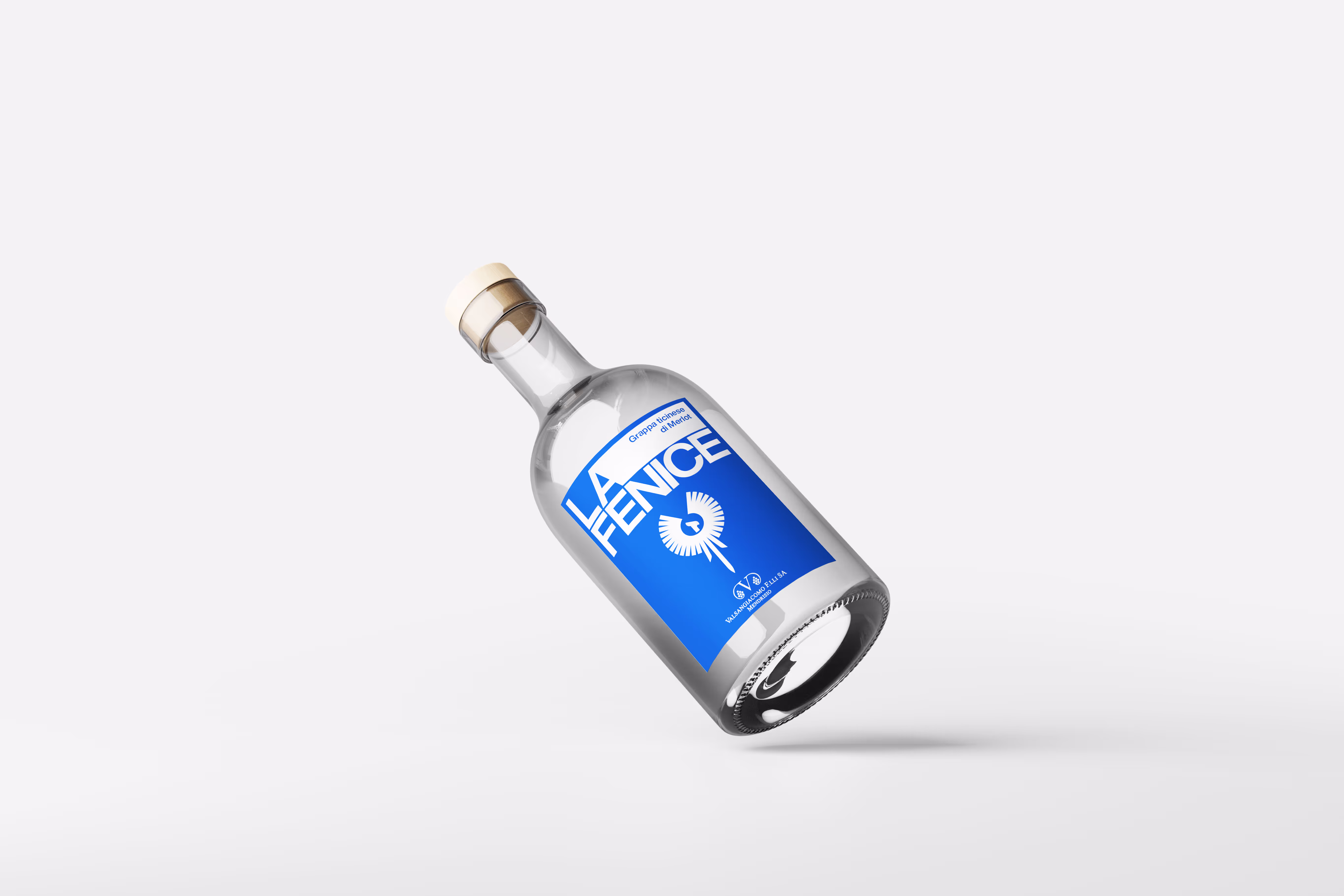
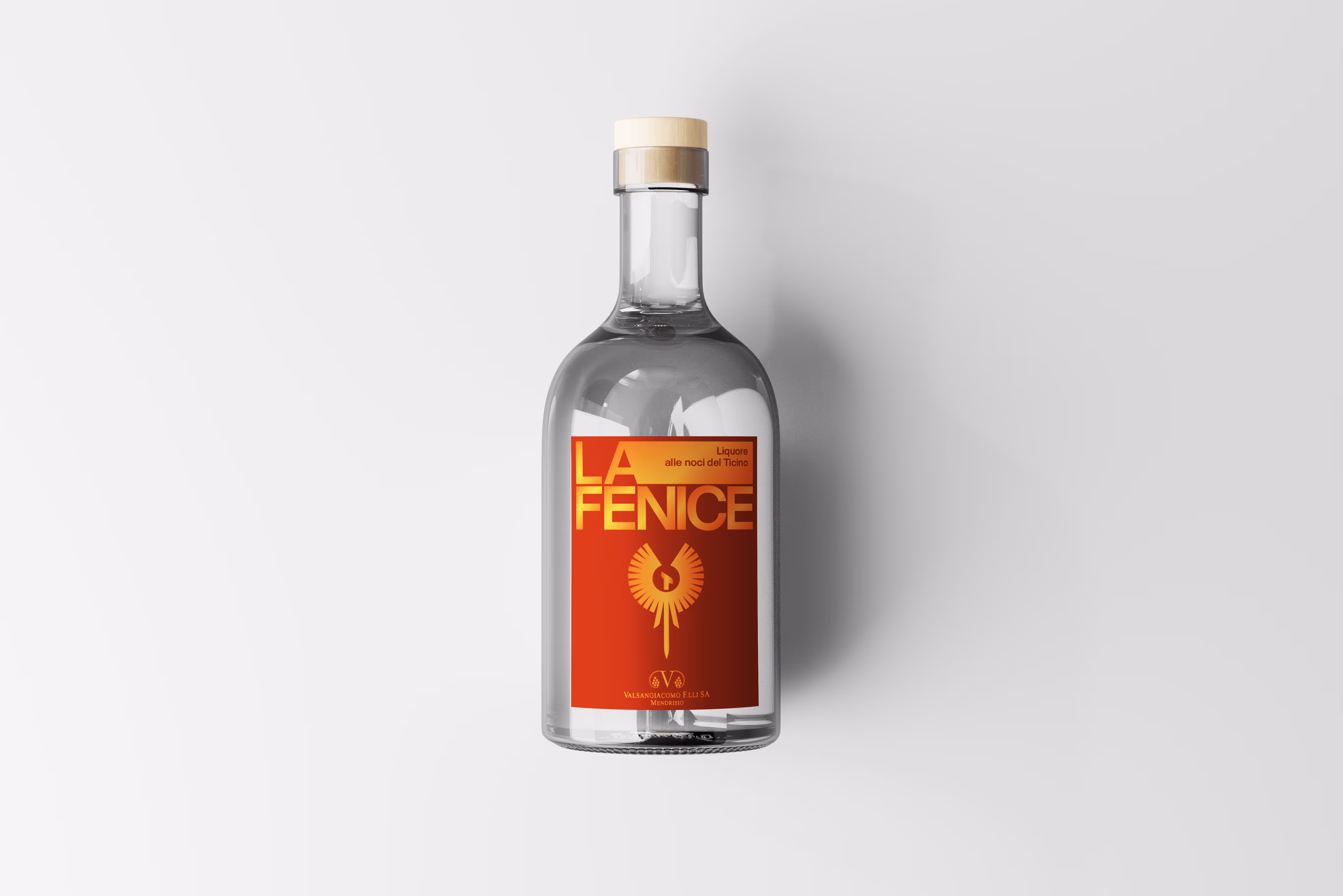
Valsangiacomo Vini, a historic winery from Canton Ticino, has tasked us with refreshing and modernizing the labels for their "La Fenice" line of grappas. Our goal is to revamp the visual identity while preserving the essence and tradition of this prestigious line of spirits.
Graphic Design
The redesign of the "La Fenice" labels for Valsangiacomo Vini began with a thorough study of the color palette, carefully selecting tones that would both enhance the product and reinforce the brand's heritage. Our goal was to retain a strong connection to tradition while infusing the design with a modern twist to attract new consumers.
The centerpiece of the label, the phoenix, was completely reimagined. We chose to stylize the iconic phoenix, transforming it into a sleek and minimalist figure that retains its symbolic power of rebirth and strength. Its elegant yet bold design immediately captures attention and becomes the focal point of the new label.
We also experimented with textures and finishes. The phoenix was enhanced with embossed details and gold accents, creating a contrast that adds depth and a sense of luxury to the design. This choice not only elevates the label but also reflects the high quality of the grappa itself, highlighting its refinement. The result is a label that seamlessly blends history, elegance, and innovation, perfectly in line with the product’s exclusive identity.
Winederful by Koal Sagl
Via Capeleta 11
CH-6818 Melano
Via Capeleta 11
CH-6818 Melano